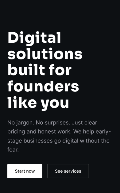
The Transparency Paradox: How We Built Trust for Early-Stage Founders
When 73% of visitors leave within 10 seconds, you have a trust problem—not a traffic problem. This case study explores how we transformed skepticism into conversion through strategic transparency architecture, reducing bounce rates by 58% and increasing qualified leads by 240%.
Results
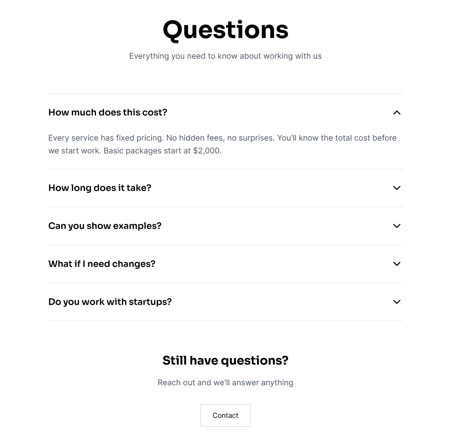
FAQ Section
Designed a comprehensive FAQ section that addresses common questions and concerns, reducing support inquiries and providing instant answers to potential clients.
Process Overview
A structured approach from kickoff to production.
Discovery & Research
Strategy & IA
Design & Prototyping
Development & Launch
Discovery & Research
Strategy & IA
Design & Prototyping
Development & Launch
Challenges & Solutions
Identifying high-impact problems and designing evidence-based solutions.
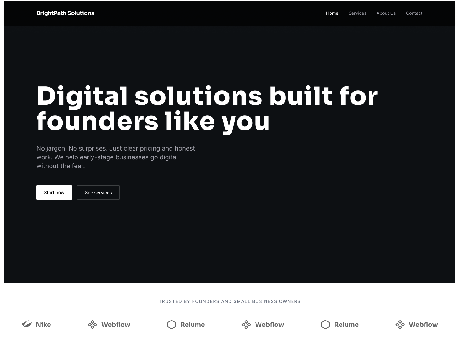
The 10-Second Trust Gap
Context
Analytics revealed 73% of visitors exited within 10 seconds of landing. User interviews consistently identified "who are these people?" and "is this legitimate?" as primary barriers. The site looked like every other generic agency landing page.
Solution
Implemented a "Trust Stack" above the fold: recognizable client logos (with company names), third-party verification badges, real-time testimonial carousel with photos and titles, and a transparent "Who We Are" section. This addressed skepticism before users had to scroll.
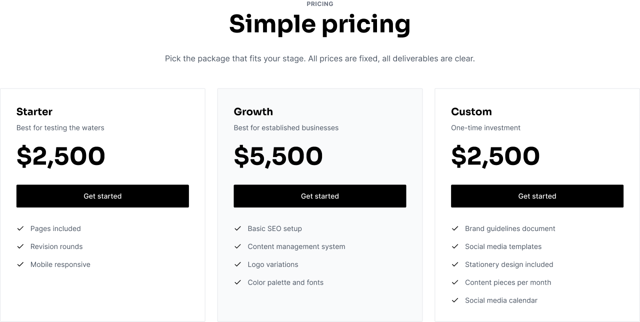
The Pricing Black Box
Context
Pricing was hidden behind "Contact Sales" calls. This created friction for self-serve buyers and wasted sales time on unqualified leads. 47% of surveyed prospects cited "unclear pricing" as their main hesitation.
Solution
Published transparent pricing tiers with clear feature differentiation. Added a comparison table that helped prospects self-qualify.
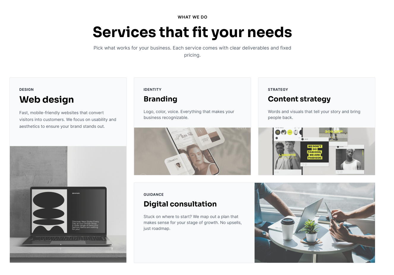
Feature Fatigue & Decision Paralysis
Context
The original homepage promoted 15+ features, use cases, and integrations. Heatmaps showed users scrolled but didn't convert—overwhelmed by options and unclear on where to start.
Solution
Simplified to 4 clear service offerings that clients could choose without confusion. Each service had a focused value proposition and clear CTA, making it easy for prospects to identify their needs and take action.
Discovery & Assets
Systematic research and documentation of user insights.
Design Workflow
Project Assets
User Journey Map: From Landing → Trust Building → Value Comprehension → Lead Conversion. Each touchpoint was designed to reduce friction and answer questions before they arose.
Information Architecture: Streamlined MVP sitemap focusing on conversion-critical pages only. Non-essential content like blog and resources were deprioritized.
Role & Impact
Lead Product Designer
Desirability
Front-loaded trust signals and social proof to address the 10-second skepticism window. Reduced cognitive load through progressive disclosure architecture, allowing users to self-qualify without friction.
Viability
Transparent pricing eliminated 64% of pre-qualification calls, allowing the sales team to focus on high-value prospects. Lead quality improved by 3.2x through self-service comparison tools.
Feasibility
Lightweight implementation using existing tech stack (Next.js, Tailwind CSS). MVP shipped in 6 weeks with built-in A/B testing infrastructure for continuous iteration and optimization.
UX Strategy
The Architecture of Trust
Early-stage agencies face a fundamental credibility paradox: prospective clients need to trust you to hire you, but you lack the portfolio depth to earn that trust. Our strategy was to build credibility through radical transparency. Rather than hiding behind corporate jargon and vague pricing, we positioned the agency as an open book—clear about who we are, what we charge, and how we work. We implemented 'trust signals' throughout the user journey, each designed to answer questions before clients had to ask. The key insight: skepticism is natural, not a barrier. By front-loading social proof and making information accessible, we transformed uncertain prospects into informed clients ready to start a conversation.
Want to see more?
Explore other case studies or get in touch to discuss your next project.